Week four of a large legacy system migration, and the weekly status call opens with the usual tension. The project manager pulls up a spreadsheet she updated the night before. The lead analyst has his own pivot table, built from a different extract. The QA lead is referencing a summary she got from someone else two weeks ago. The executive sponsor is asking whether the numbers she sees are current.
They are not. None of them are. And the team is about to spend the first thirty minutes of a sixty-minute call reconciling three different views of the same project.
This is not a rare breakdown. On migrations of any meaningful size, visibility fractures almost immediately. Someone owns "the status report" — which means the status report reflects what that one person knows, filtered through whatever they had time to update before the last meeting. Everyone else works from memory, from email threads, or from their own informal tracking. The project exists in six different mental models simultaneously, and nobody's model is complete.
The Status Report Isn't the Problem — the Pattern Is
Pointing at the status report misses the real issue. The problem is that shared visibility requires a dedicated effort to maintain. On most migrations, that effort falls to one person: the PM, the migration lead, whoever owns the master tracker. That person becomes a reporting bottleneck. If they're out sick, the status report doesn't get updated. If they're buried in an escalation, the numbers go stale. If they leave the project, the institutional knowledge walks out with them.
The pattern creates a specific kind of risk. Decisions get made on incomplete information because the team doesn't know what it doesn't know. A data quality problem identified in a source table on Tuesday doesn't make it into the status report until Friday. By Thursday, a mapping decision has already been made based on assumptions that the quality issue would invalidate. Nobody connected the dots because nobody was looking at the same picture.
There is also the coordination cost. When the team operates from different views, every sync call starts with calibration. Before the group can discuss what to do, they have to agree on what's true. That calibration work compounds over a multi-month project into a significant drain on meeting time that could otherwise be used for decisions.
What a Shared View Actually Requires
For shared visibility to work in practice, it has to meet a few conditions that are harder to satisfy than they appear.
The data has to be live. A report that's regenerated weekly is better than nothing, but it's still a snapshot. The team needs to know that when they open the dashboard on a Tuesday afternoon, what they see reflects what's actually in the system right now — not what was true at last Friday's extract.
The view has to be persistent. Team members shouldn't have to rebuild their filter configuration every time they open the tool. If the migration lead has set up a view that shows only incomplete mappings for a specific source system, that view should be waiting for her the next time she opens it.
It has to serve multiple roles. The executive sponsor wants a high-level progress summary. The data analyst wants a breakdown of quality flags by table. The QA lead wants to see open Q&A items by status. A single shared dashboard that shows everything to everyone typically shows nothing useful to anyone. Different roles need different charts — but they need those charts drawing from the same underlying data.
And it has to require no maintenance. The moment the shared view requires someone to manually refresh it, export it, or copy numbers into it, it becomes a bottleneck again.
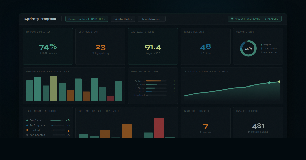
How dmPro Project Dashboards Work
dmPro has always had dashboards. Individual users can build personal dashboards — assembling charts from the ~100 built-in chart types, configuring filters, saving the view exactly as they want it. A data analyst might keep a personal dashboard focused on mapping completion rates and data quality scores for her assigned tables. A developer might maintain his own view of job status and extract query readiness.
Those personal dashboards are exactly that: personal. They're private to the user who built them.
Project Dashboards work the same way — same chart library, same filter options, same saved-state behavior — with one critical difference: they're visible to every member of the project team.
A migration lead creates a Project Dashboard, names it something the team will recognize ("Sprint 3 Progress" or "Phase 2 Data Quality"), and adds the charts the team needs. She configures filters — maybe scoping it to a specific source system, or to tables flagged as high-priority — and saves. From that point forward, every team member who opens that dashboard sees exactly what she sees. Same charts, same filters, same data — live, every time.
When the whole team is working from the same live dashboard, the question shifts from "whose numbers are right?" to "what do we do about what we're seeing?"
The filter state is the piece that matters most in practice. On a large migration, a project might have five or six Project Dashboards, each scoped to a different focus area: one for the current sprint, one for a particularly complex source system, one the executive sponsor opens before every steering committee. Each one remembers its configuration. Nobody has to set it up again.
Before and After
Before Project Dashboards, the migration PM owns the status report. It gets updated when she has time. It reflects what she knows. When the team reviews it, half the discussion is about whether the numbers are current and whose data is right.
After Project Dashboards, the dashboard is the status report. The PM creates it once, configures it for the team's current priorities, and it stays current automatically. When the team reviews it, the discussion skips the calibration and goes straight to the migration problems that actually need attention.
The difference in meeting quality is immediate and noticeable. Teams that have operated with fragmented views for months sometimes describe it as a small shock — the first time everyone in a room is genuinely looking at the same thing.
Alignment as a Risk Control
Misalignment on a migration isn't just an inconvenience. It's a risk multiplier.
When the team operates from different versions of project status, problems surface late. A data quality issue that's been visible in one analyst's personal tracker for a week doesn't become a team problem until someone surfaces it in a meeting — by which point other decisions may have already been built on top of a flawed assumption.
When the team operates from a shared live view, problems are harder to miss. The data quality chart shows the spike the moment the analysis run completes. The mapping progress widget reflects the stall in the current sprint. The open Q&A count is visible to everyone — not just the analyst who happened to check her personal dashboard that morning.
The value isn't just coordination efficiency. It's the reduction in the probability that a known problem gets missed because it lived in a silo. On a migration where a late-discovered data quality issue can push a go-live date by weeks, that reduction in miss probability is worth a significant amount.
Project Dashboards in dmPro are one of those features that seem operational on the surface but carry a governance benefit underneath. The shared view isn't just convenient — it's a mechanism for keeping the team's collective understanding of the project accurate and current, all the way to completion.